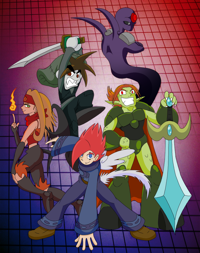
Thursday 6 December 2012
Professional Example!
I would like my model to be inspired by the style used in this video. It's a 3D representation of a western comic-book style so it should be reletively easy to replicate. Luckyly my model won't require this much detail and I won't need human models!
My hopes for this project is to get something similar to what is shown in the video... but obviously at my current skill level, that isn't really going to happen.
Thursday 29 November 2012
House Model Practice

Thursday 22 November 2012
3D Environment! First attempts


We were tasked with creating a photorealistic environment using a displacement map. First we created a JPEG file in photoshop as seen here. As you can see, Lighter areas are the parts that'll be higher up, it's sort of like a gradient map. To get this effect, we created a plane in 3Ds Max and added the modifier "Displace" which moulds the plane into the shape created by the JPEG in Photoshop.
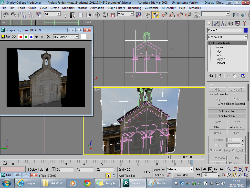 Next up was starting to model a building. We were tasked with modeling Salts Mill/Shipley College. We modeled it from Planes and used Photos as temlplates. We started with a polygon count of 4 and built out from those 4 polygons. It was very challenging to get started but once I got going it was reletively easy until it came to individual parts of the building such as the windows and the arch on the roof!
Wednesday 7 November 2012
Team Logo Development

- Our Flash artist (Rory) uses it as his DeviantART account name
- It sums most of our team up nicely
- It just sounds awesome
 First order of business, we had to experiment with different Fonts for our Logo's. Seeing as our name implies computers and such, I decided to search for some sci-fi inspired styles. I also experimented with a few gothic styles as well, just for a bit of diversity. Next, we had to think about colour schemes weather it be blues, reds, greens, yellows... whatever. I went for blues and maybe a little green. Blue my not sound to cyber-esque but I took that colour scheme from Tron which uses blues everywhere. After that, we considered types of shapes, I considered a sort of Trible pattern but turned out to be a flop.After Failing my trible idea, I looked at logos such as the Rockstar Games Logo and the Machinima Logo which are quite simple and easy to understand.
This design came out a whole lot better than my trible inspired logo. It could still use some tweeking though. For instance, the small print may be to hard to read once the logo is very small. A solution to this could be a larger font wraped around the logo itself.
Monday 22 October 2012
Production Team
Team Name: Cybercondriacs
Team Leader: Ali Ahmed
Concept artists: Leanne and Lawrence
Photoshop Artist: Lawrence
Flash artist: Rory
3D Modeler: Tony
Blogs:
Tony: http://www.tony
Rory: http://www.rory
Leanne: http://www.lala
Ali: http://www.alis
Route focus: Green Route
Team Leader: Ali Ahmed
Concept artists: Leanne and Lawrence
Photoshop Artist: Lawrence
Flash artist: Rory
3D Modeler: Tony
Blogs:
Tony: http://www.tony
Rory: http://www.rory
Leanne: http://www.lala
Ali: http://www.alis
Route focus: Green Route
Monday 15 October 2012
Psychology of Sound
http://www.youtube.com/watch?v=bDUnQs4u2oQ
Ib Main Theme - Orchestral Version
This piece of music makes me feel emotional and reminds me of something Tim Burton would use in one of his films. In some places it reminds me of a deep sea scene. It's very surreal in places too and turns into something that wouldn't be out of place if it were played in an aristocratic ball.
http://www.youtube.com/watch?v=dBITwDfPags&feature=related
Dragon Force - Fairy Tail Battle Music
This piece is action packed and reminds me of fast paced fighting. It gives me goosebumps just by listening to it. It has an epic vibe to it and reminds me a little of a bard playing in an inn... but more fast paced with drums and guitars! It fits with action and will not suit emotional scenes at all.
http://www.youtube.com/watch?v=bty4-TgBV9I
115 - Elena Siegman
This song is really action packed just like the above piece. This reminds me of an opening to a shounen anime like Bleach or Death Note. It has it's down moments to when it gives the feeling of epicness. Not much to say about it really. It is very religious based and talks about the second coming of Jesus and the Anti-Christ. It's used in the Call Of Duty: Black Ops Zombie mode as a kind of unlock-able battle music.
Monday 8 October 2012
Science of Sound
Wave Length
The wavelength is the distance over which a sound wave repeats. It is usually determined by considering the distance between consecutive corresponding points of the same phase, such as crests, troughs, or zero crossings. Wavelength is commonly designated by the Greek letter lambda (λ).
Amplitude
Amplitude is the intensity of a change in an Oscillating Variable. For example, Sound waves in the air are oscillating in atmospheric pressure and their Amplitudes are directly proportionate to the change in pressure.
Thursday 4 October 2012
HCI Update
Today, I added more pages to my HCI concept and made interactive buttons for switching between the different pages. Problems arose during writing the first piece of code for a button but that was easily rectified by getting my friend to teach me the basics and then I figured the rest out myself. Scripting in Action Script is a good language for people who aren't really that adept in programming. In fact the animating in flash is actually a lot harder than the scripting. When I first introduced a second page the animation looked like it was having a seizure by switching back and forth every half a second. Then I learned of a stop function witch stops the current scene from switching to a new scene. That is where the buttons come in handy. Buttons aren't just used for switching scenes though. They can be as simple as a start button for a certain animation or as complex as a "click to reload" or a "Click rapidly to open gate" type of button. My HCI might not yet be completed but it's well on its way to being a fully interactive HCI map


This code is for the "Back" button. It's basically saying once the button is released then it will go back to scene 1.
Thursday 13 September 2012
Multi-Story Water 3 Routes Info
GREEN - Weir to Weir - [ Filming with CD/MB - FRIDAY @ 3pm & Sun@ 3pm] Agreed Points of Interest on this Route [15] : Hirst Wood, Hirst Lock / Weir / Mill, Roberts Park / The Lodge / Bandstand / Cricket Pavilion / Sports area / tennis courts, Shipley Glen/Tramway/Dodgems, Higher Coach Road Estate / The Mansion, BLUE - Lock to Wharf - [Filming with CD/MB - Friday @ 4.30pm & Sun@ 12pm] Agreed Points of Interest on this Route [6]: Shipley Wharf / Canal boats, Saltaire train station, UR Church, Salts Mill / Early Music Shop RED - Mill to Mill - [Filming with CD/MB - Friday @ 5.30pm & Sun@1pm] Agreed Points of Interest on this Route [10]: Salts Mill, Shipley Wharf / Noble Comb, Shipley Wharf / Swing Bridge, Saltaire & Shipley train stations, Dixon Mill, Lower Holme Mill, Victoria Mill |
Maps and HCI (Human Computer Interface)

We have been asked to create a flash site for a map of the Shipley stretch of the Leeds - Liverpool Canal. We are marking key historical landmarks so you can hover your mouse over them and look at the story of that building. We will be marking the points of interest with icons most likely of our own creation and animate them to be interactive buttons. This might prove difficult because my Adobe Flash skills aren't as good as my Photoshop skills. The style I'm doing this map in is quite simplistic but sometimes simplicity is better than an elaborate and over the top design.
Friday 17 August 2012
First Commission job
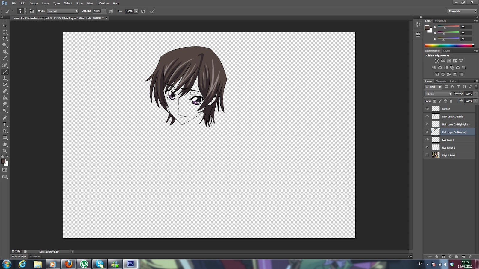
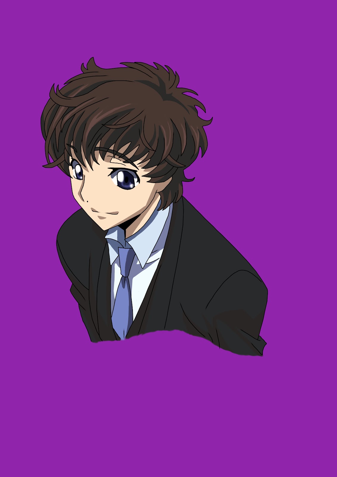 A friend of mine wanted me to draw him in anime style and offered to pay for my services. It wasn't an official commission job but I'm still being paid for it. This job wasn't to difficult to complete but I did have troubles with shading and hair detail. All together it took about six or seven hours to complete fully (estimated) The drawing was done entirely in Photoshop CS6. It might have turned out a little better if done by hand first but this was also a test as to weather or not I could draw in photoshop to a professional standard.
Monday 16 July 2012
Lelouche and Kallen Photoshop Art


Thursday 28 June 2012
Stop Motion, The Animation!
This is my cut of our team's animation. For a more professional cut, check on youtube on this link: http://www.youtube.com/watch?v=JCTHA6lA9LY
Monday 25 June 2012
Stop Motion Reflection.
Link to stopmotion animation: http://www.youtube.com/watch?v=Dym8DD1AhHc&feature=plcp
· What did you do and how did you do it?
We split into teams and set out to create a full Stop Motion animation. My team took toy figures and animated them. We were originally going to do claymation which is moving clay and taking repeted photos. An example of claymation is Wallace And Grommit.
· Does your final design meet your original intentions?
No. Our original design was supposed to be pretty serious with fighting and some gore, the outcome was comedic and confusing in places. We did have an idea to make it funny but we wanted it to be mainly serious. In all we needed more time to make what we originally intended
· Self evaluation – how did you manage your time? How could you manage your time more effectively?
With the time we had, we managed it well. If we had more then we could have made something more... asthetically pleasing.
· What did you struggle with? E.g. Texturing, modelling, lighting, animation
We struggled with getting the materials above everything else. In the end we had to make do with a figure of a power ranger, 1 model of a zombie made by Zac and a figure of a monster. It turned out ok for what we had.
· What did you find easy?
We found that the photographing and animating was the easiest to do.
· How does your finished design compare to professional examples?
Our animation is way to uncut and rawr to even compare to a professional example. True that our animation has a certain amature charm to it but compared to a real stop motion... it just doesn't cut it.
· What do other people think of your finished design?
Our peers seemed to enjoy it a lot. We had good reviews in the "Survey Monkey" survey we sent out. A few people even said they would pay to see it!
· What could you improve upon?
If anything, resource management and gathering
· If you were to do it again what would you do differently next time?
We would try to stick to the original design and use clay.
Friday 1 June 2012
Stop Motion... not to plan
We set out to make the character eventually die. Unfortunately due to lack of materials and time, we settled for a walk onto the screen, crawling zombie and a big monster falling onto the crawler. It now ends with the character and the monster making up after the character helps the monster with his head that gets stuck. It's a confusing animation but we had set backs in development that led us to make it.
Friday 11 May 2012
Stop Motion... The Plan
Our stop motion animation is going to have a slight comedic genre to it. It starts with the main character falling off a Motorbike and discovers some Zombies. A fight breaks out and he manages to fend off the zombies until one bites him on the ankle and he says "Looks like this is the end" followed by dramatic music. Then some random figure pops into the screen and yells "ugga bugga bugga!" well that killed the mood...
Thursday 3 May 2012
Wednesday 2 May 2012
New Art Style

This is a new drawing style I have been working on. It's slightly more cartoon style then manga. I got the inspiration from some drawings I saw on a vocaloid music video. I thought "I wonder if my characters would look good done in that style" and it turns out they do... well... Jack does anyway, I haven't drawn any others yet. Anyway I hope to try and develop this style more.
Monday 23 April 2012
Vocaloid 3D poses - Kaito


Friday 20 April 2012
Stop motion inspired Flash Animation
I have made a flash animation of a little stick guy going Super Sayain and firing off a Kame Hame Hah. It's on a permenent loop and looks really good. It was difficult to get it going but once I figured it out and got started it was easy yet repetative. I want to make more flashes like this in the future. Unfortunately I cannot seem to show you the product.
Monday 26 March 2012
Comic Strip Reflection
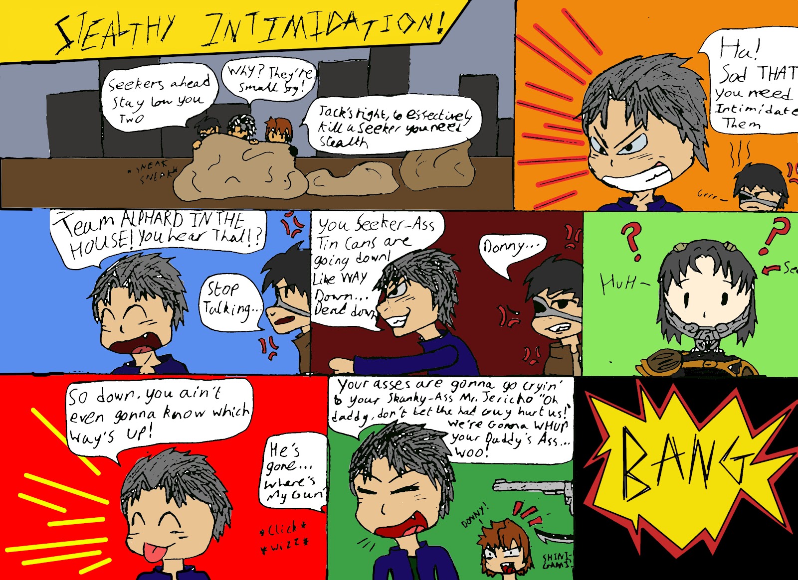
I will Compare my Flash animation with TOME, a professional series on Newsgrounds.com My animation doesn't really move a lot so the characters are always static. Although both examples are of a comedic genre I think TOME portrays it better because it's fully voiced and is a lot longer... it also has funnier content. The characters in my comic don't really get introduced and you are just thrown into it but in TOME it takes time introducing each character and develops them well.
•What could I do better next time?
I guess I could include more animation in mine. It was a little static and only speech moved plus one instance of a gun moving into the screen. I could also include a little more explanation to the story, the characters just... pop into the animation without any introduction and you don't really get to learn their names.
•What skills could I improve upon?
I need to improve my animating skills in flash and include buttons and more dynamic animations. My Flash art skills are good but they could use some toning, I'm to used to tracing images and not drawing my own. Also planning needs to be to a higher standard than just a few slides and storyboards.
I need to improve my animating skills in flash and include buttons and more dynamic animations. My Flash art skills are good but they could use some toning, I'm to used to tracing images and not drawing my own. Also planning needs to be to a higher standard than just a few slides and storyboards.
•What went well?
I think the art aspect of the project went quite well. The visual style was consistent through out the animation. The speech of the strip stayed consistent too, it was a well rounded animation but there wasn't much to it, but maybe that's its charm; short, sweet and funny. Makes sense if you think about it, the longer a joke is the less funny it could become if told wrong.
I think the art aspect of the project went quite well. The visual style was consistent through out the animation. The speech of the strip stayed consistent too, it was a well rounded animation but there wasn't much to it, but maybe that's its charm; short, sweet and funny. Makes sense if you think about it, the longer a joke is the less funny it could become if told wrong.
•What did not go so well?
At first I could not get the timings and frames right but after revision I just added more frames and it seemed to work out fine. During the process I did come up with a few bugs like missing frames and animations that didn't quite go to plan such as in the Confused Seeker panel the question marks would not move the way I wanted until I redid that part of the animation until it functioned correctly.
At first I could not get the timings and frames right but after revision I just added more frames and it seemed to work out fine. During the process I did come up with a few bugs like missing frames and animations that didn't quite go to plan such as in the Confused Seeker panel the question marks would not move the way I wanted until I redid that part of the animation until it functioned correctly.
•Time management – did I use my time well?
The time I was allowed gave me more than enough time to complete the animation and Revise it several times before handing it in. So I believe I used the time to the best of my ability and possibly more. I seemed to finish before most people in the class and even had time to do other animations such as a simple platformer game that actually worked.
The time I was allowed gave me more than enough time to complete the animation and Revise it several times before handing it in. So I believe I used the time to the best of my ability and possibly more. I seemed to finish before most people in the class and even had time to do other animations such as a simple platformer game that actually worked.
•What have learned – how far have I traveled
I have discovered that I am quite a good Flash artist but I realized I still need a bit of work on animating. When I first started the project I was a little nervous because I didn't really know how to work in Vector form but once I grasped the basics I gained confidence and produced some good pieces of work such as a fully functioning platforming game with simple reset boxes and even a Vision camera that follows the character.
I have discovered that I am quite a good Flash artist but I realized I still need a bit of work on animating. When I first started the project I was a little nervous because I didn't really know how to work in Vector form but once I grasped the basics I gained confidence and produced some good pieces of work such as a fully functioning platforming game with simple reset boxes and even a Vision camera that follows the character.
•What am I confident with
I am confident with my ability to create good pieces of artwork using Flash's drawing tools. I'm also confident with the timeline and how it works. I am now confident in using Flash as a whole.
Friday 23 March 2012
Particle Effects
It's been a while since I posted 3D work on this blog. I decided to test out some particle effects like this one witch is a bomb witch is a Geometric Space Warp and also added in a SphereGizmo with a fire effect on it. It was tricky to figure out how to use these tools but in the end after a few minutes looking through Youtube for a good tutorial I managed to produce this video.
Wednesday 14 March 2012
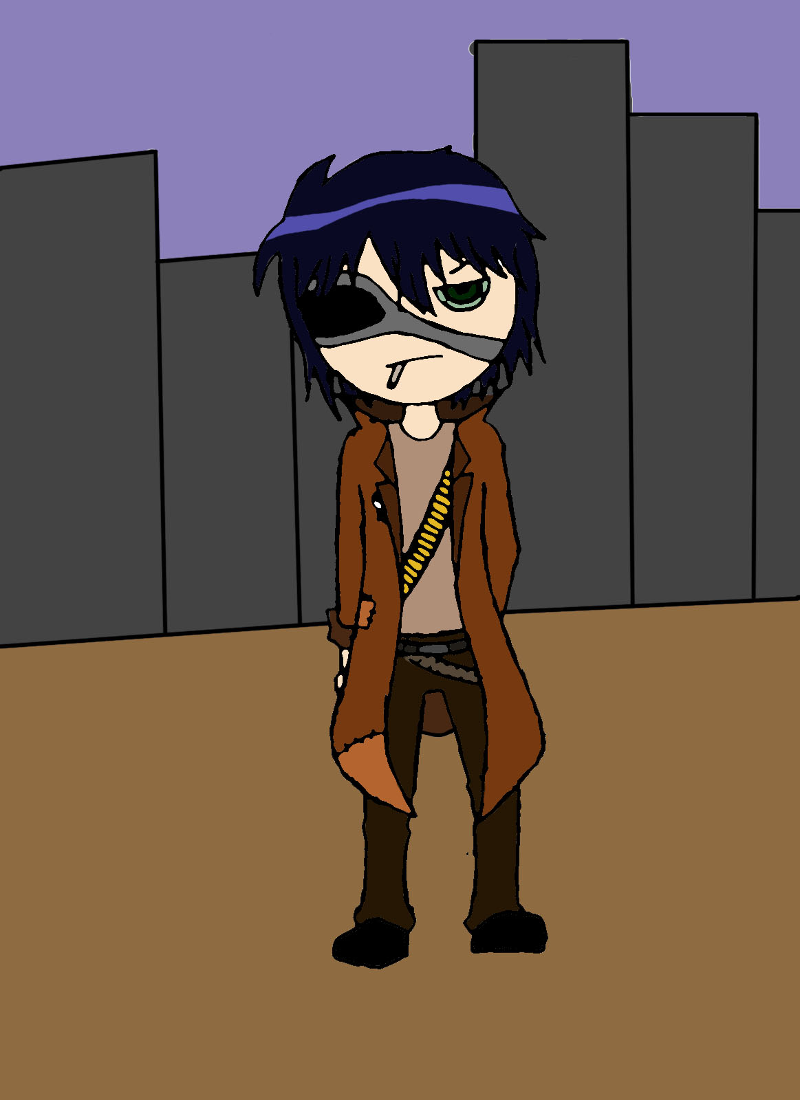
Alphardrich Bio
Age: Unknown
Gender: Male
Blood type: A
Back Story:
Alphardrich was once a proud warrior of the Asylum Military but after an incident involving the murder of Alphardrich's family, he rebelled and fled to the Duster ring for one year staying hidden until he got reunited with an old friend, Lin Albright perhaps rekindling a lost relationship. He joins the Resistance movement and is now fighting for the freedom of the Duster ring and also for vengeance.
Wednesday 7 March 2012

Friday 2 March 2012
Mini class Showcase type thing
I presented my work to the class and got quite positive reviews although people said I needed to incorporate my flash work together such as my platformer can be Incorporated with my comic strip. The final outcome of this unit is to make an animated banner for a website, it has to advertise a game of my choice. I was thinking of doing the game I am currently designing (Asylum) and I plan to incorporate some form of interactivity to the banner
Tuesday 21 February 2012
Game and anime reviews at Danime.info
Hey readers, For those who are interested in reviews of games, anime and manga I have started to post reviews on a little site known as http://danime.info/ my username on the site is (obviously) JackAlphard. I'll be posting reviews ranging from Clannad to Fallout New Vegas. I'll also be posting face offs occasionally so keep your eye out on the site.
Friday 10 February 2012
Flash Platformer game (IN PRODUCTION!)
I am currently programming and designing a game. Just a simple platformer but even a simple game like that can be very hard to programme correctly. I used a reset box for respawning and the ground and character work together in the programming. I need a VCam (Visual Camera) to be programmed so that the camera follows the character. I'm also planning on programming a life bar and hit boxes and hazards but so far I don't have the skills to do that... but soon I will
Friday 20 January 2012
Final Render!
This is the final render of my animation.
What could I do better next time?
I Could have made the model more appealing to look at rather than just a simplistic 44. Magnum. The Animation was also a little simplistic and I could have made it more complex but I did not have much time so I could only manage a 9 second long animation.
What skills could I improve upon?
I Could improve my animating skills because I couldn't quite get the timings right. My modeling skills could use work too.
What went well?
The model itself turned out pretty good and the animation looked at least satisfactory.
What did not go so well?
SAVING! I made the mistake of not saving my work occasionally and the programme crashed causing all my work to be lost so I needed to restart the animation
Time management – did I use my time well?
I used my time moderatly well untill it was wasted by my saving mistake, then I was forced to do the whole animation over again.
What have I learned – how far have I travelled?
I learned more about animating in 3Ds Max and a little more about lighting. I think I have travelled a little way on the road to 3Ds Max MASTERY!
What am I confident with?
I am confident with my abbility to model but not so much in animating, I need to work on that
Did I get the desired outcome?
Well considering the fact that I originally wanted a gun firing then a reload instead of just a reload... no i didn't get the desired outcome, but I still like it!
Thursday 19 January 2012
One point and two point perspective
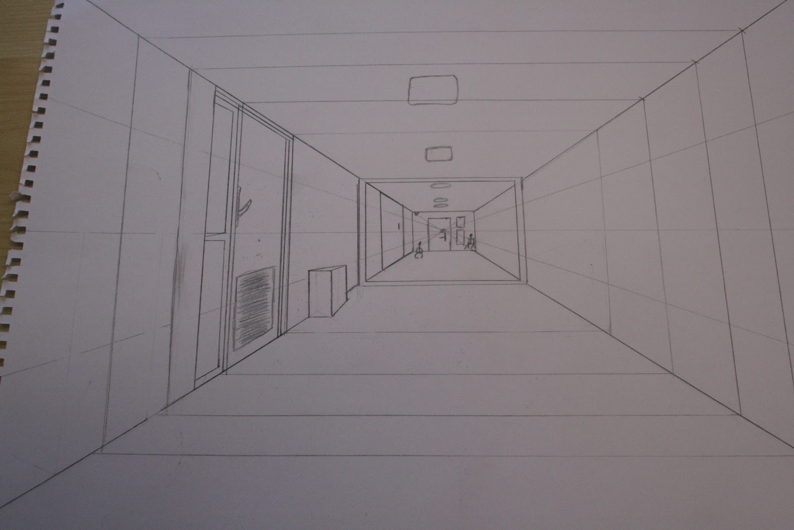
One point perspective is a drawing that has one vanishing point. everything in the picture is in line with the guide lines. It was quite a challenge to draw one point because it was hard to get it all in line and detail was a pain to draw correctly.

Two point perspective is a drawing with 2 vanishing points and is usually drawn on a corner of a street or something. this drawing in particular is pretty bad and isn't a good example of a two point drawing
Friday 13 January 2012
Test render for Gun Fire
This is the first render of the gun fire for my Time animation assessment... it need to be 10 loooooong seconds! THIS ISN'T EVEN 1!
This test fails compleatly. the bullets come out unevenly and the gun jolts are not in sinc. This is a failed test. I need to revise the timeline and edit it
I decided to change the animation to reloading the gun and snapping the mag back into place. From there, maybe a gun twirl if I can figure out a way to time it
Subscribe to:
Posts (Atom)