
Thursday 29 November 2012
House Model Practice
Thursday 22 November 2012
3D Environment! First attempts


We were tasked with creating a photorealistic environment using a displacement map. First we created a JPEG file in photoshop as seen here. As you can see, Lighter areas are the parts that'll be higher up, it's sort of like a gradient map. To get this effect, we created a plane in 3Ds Max and added the modifier "Displace" which moulds the plane into the shape created by the JPEG in Photoshop.
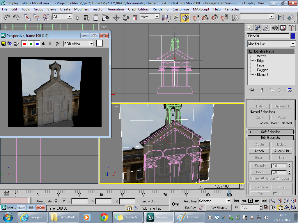 Next up was starting to model a building. We were tasked with modeling Salts Mill/Shipley College. We modeled it from Planes and used Photos as temlplates. We started with a polygon count of 4 and built out from those 4 polygons. It was very challenging to get started but once I got going it was reletively easy until it came to individual parts of the building such as the windows and the arch on the roof!
Wednesday 7 November 2012
Team Logo Development

- Our Flash artist (Rory) uses it as his DeviantART account name
- It sums most of our team up nicely
- It just sounds awesome
 First order of business, we had to experiment with different Fonts for our Logo's. Seeing as our name implies computers and such, I decided to search for some sci-fi inspired styles. I also experimented with a few gothic styles as well, just for a bit of diversity. Next, we had to think about colour schemes weather it be blues, reds, greens, yellows... whatever. I went for blues and maybe a little green. Blue my not sound to cyber-esque but I took that colour scheme from Tron which uses blues everywhere. After that, we considered types of shapes, I considered a sort of Trible pattern but turned out to be a flop.After Failing my trible idea, I looked at logos such as the Rockstar Games Logo and the Machinima Logo which are quite simple and easy to understand.
This design came out a whole lot better than my trible inspired logo. It could still use some tweeking though. For instance, the small print may be to hard to read once the logo is very small. A solution to this could be a larger font wraped around the logo itself.
Subscribe to:
Posts (Atom)